
13 min read · September 27, 2026
Adjust Brightness, Contrast, and Saturation Online (Free Guide)
Learn how to adjust brightness, contrast, and saturation online with live preview. Fix dark, flat, or dull photos free with ImageToolkit — no Photoshop, no signup.
Here’s the quiet truth about most “bad” photos: the subject was fine. The tone wasn’t. A dinner plate looks muddy. A product box looks gray. A landscape looks flat as cardboard. Learning how to adjust brightness contrast saturation online gives you three simple dials that fix those problems fast—without a desktop suite, without a tutorial marathon, and without hoping “auto enhance” guesses right.
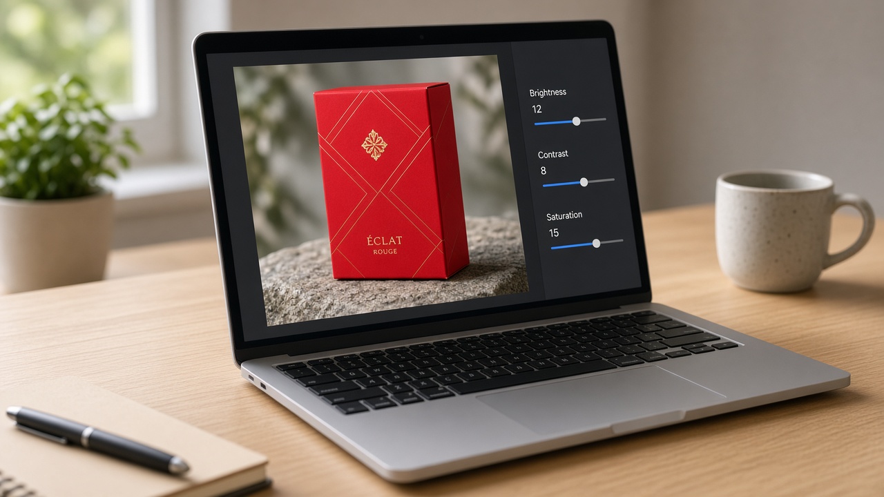
Last month I almost published a client product shot that looked like it had been left in the rain. Flash killed the red packaging. Contrast sat there soft and sleepy. I felt that familiar itch to open a heavy editor, then I stopped myself. I dropped the JPEG into a free browser adjuster, lifted brightness a notch, pushed contrast until the edges woke up, then nudged saturation until the box looked like the real thing again. Under a minute. No drama. The client never knew how close we came to shipping a sad potato.
Keep reading and you’ll walk away with more than vague tips. You’ll get clear definitions, the slider order that usually works, a five-step how-to you can repeat today, recipes for common photo messes, and the traps that make edits look fake. I’ll also show where a focused tool beats a mega editor—and where it doesn’t.
So if you’ve been living with “good enough” images, stay with me. Once you know which dial to turn first, dull photos stop feeling like a wall. They start feeling like a five-minute job.
How Do I Adjust Brightness, Contrast, and Saturation of a Photo Online?
Upload your image to a free online adjust tool such as ImageToolkit Adjust. Raise brightness for dark frames, increase contrast for flat tones, then tune saturation for color intensity. Preview live, apply, and download. No Photoshop needed. Use small steps so skin and highlights stay natural.
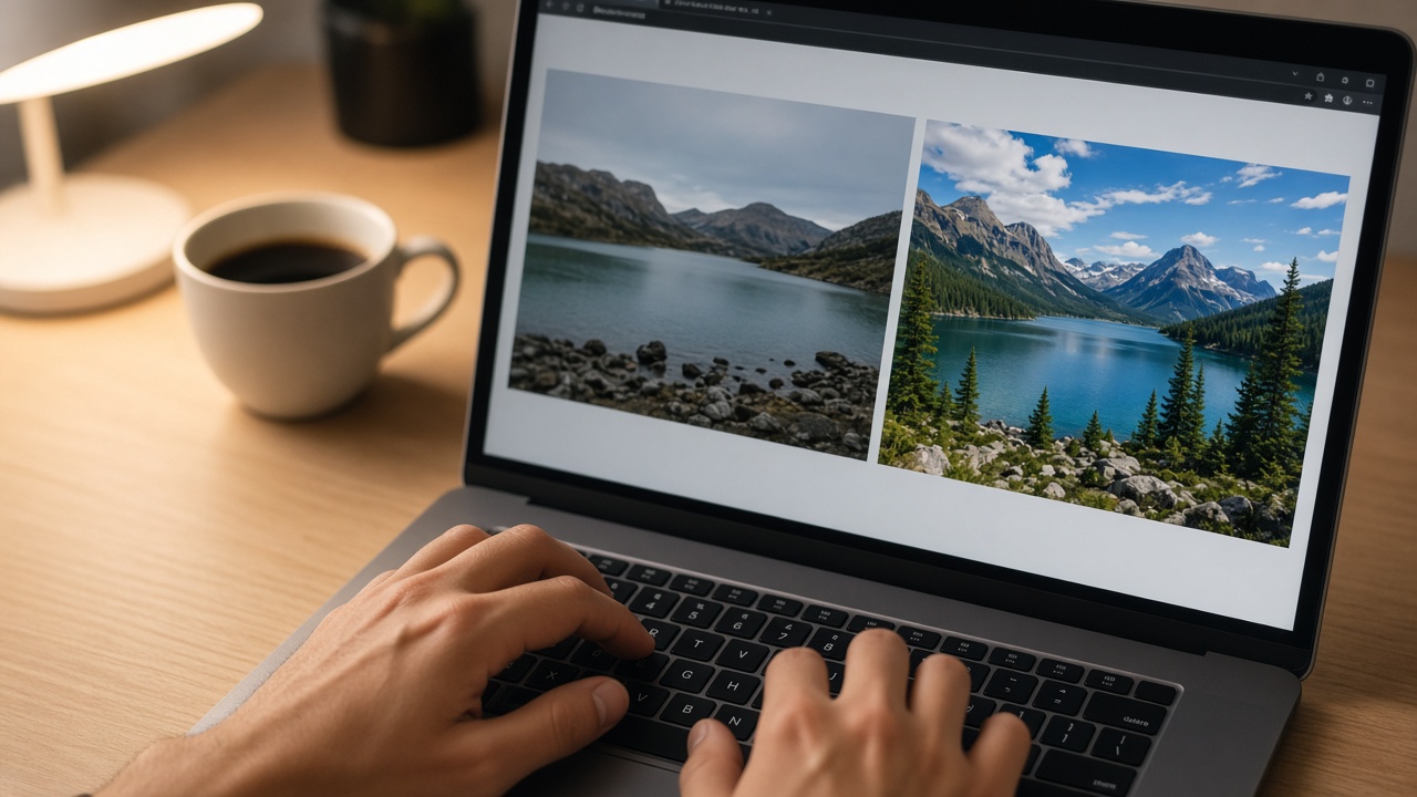
Adjust Brightness, Contrast, and Saturation Online: A Complete Practical Guide
I think people overcomplicate photo fixes. Layers. Curves. Masks. Those tools matter for deep work. For everyday tone? Three dials do most of the heavy lifting: brightness, contrast, and saturation.
In my opinion, a focused color adjust workflow beats a crowded editor when speed matters. ImageToolkit’s Adjust tool keeps the job narrow—live preview in the browser, then Apply so you can download the corrected file. Free. No account. No watermark. Upload limit sits around 15 MB, which covers almost every phone JPEG I use.
Let’s argue the useful case: if your photo is too dark, too flat, or too dull in color, you don’t need a studio stack first. You need the right order on three controls. Here’s how.
Upload Your Photo and Set a Clean Starting Point
Open Adjust Brightness, Contrast & Saturation. Drag and drop the file, or browse. Stay under 15 MB.
JPG and PNG cover most cases. WebP works for many browsers too. If you’re sitting on a huge RAW file, export a JPEG first. This tool is for quick tone polish, not camera-RAW development.
Rename before upload if you care about later chaos. “red-box-listing-v1.jpg” beats “IMG_4482.jpg.” Future-you will thank present-you. Ask me how I know.
Look at the original once before you touch anything. Is it dark? Flat? Oversaturated already? That quick diagnosis saves you from turning every slider because you’re nervous.
Adjust Brightness to Fix Overall Lightness
Brightness shifts how light or dark the whole frame feels. Raise it and pixels lift. Lower it and the image darkens. It’s your first move for underexposure—think dim cafés, evening rooms, hallway shots.
I feel beginners go too hard here. A huge brightness jump lifts blacks into gray fog. Suddenly the photo looks milky, not “better lit.” Small moves. Watch the live preview. Stop when midtones read clearly and highlights still hold shape.
Too bright already? Ease brightness down before you chase contrast. Trying to “fix” a washed frame with more saturation usually makes it louder and worse. Get the light level honest first.
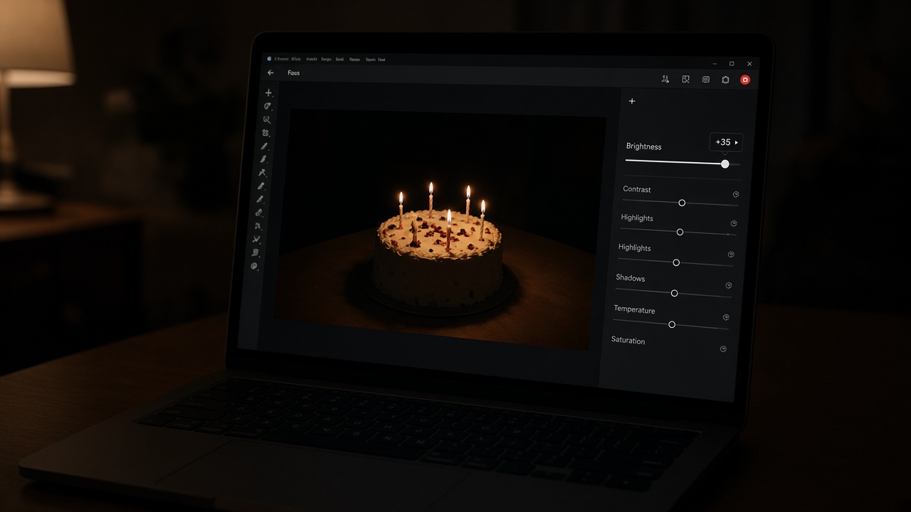
If your main problem is a truly crushed dark photo and you want a deeper rescue playbook, use our companion guide on how to brighten a dark photo online free. This article stays on the full three-dial system.
Increase Contrast to Separate Dark and Light Tones
Contrast is the gap between shadows and highlights. More contrast deepens darks and lifts lights. Less contrast flattens the look. Flat scans, hazy outdoors, and soft phone snaps often need contrast more than brightness.
Here’s my argument: if a photo looks lifeless after a brightness lift, don’t panic-reach for saturation. Add a modest contrast bump. Contrast often restores “depth” that brightness alone can’t give.
Watch clipping. Pure white with no detail. Pure black with no texture. If a white shirt melts into the background, ease contrast back. Sometimes the winning combo is slightly less brightness plus slightly more contrast. Odd. Effective.
Document scans love contrast. Portraits want a gentler hand. Harsh contrast on skin can look mean fast. Match the medicine to the subject.
Tune Saturation After Tone Looks Right
Saturation controls color intensity. Higher values make hues vivid. Lower values mute them. Drop far enough and you’re in grayscale territory.
Do this last. Why? Because contrast already changes how vivid colors appear. If you saturate first, you’ll redo the work after contrast moves. That’s the long road. I’m allergic to the long road when a short one exists.
Food, products, and landscapes can take a light lift. Skin usually wants restraint. Oversaturated cheeks turn tomato. Oversaturated grass turns plastic. If the edit screams “FILTER,” you overshot. Pull back.
Want a muted editorial vibe? Lower saturation on purpose after tone is set. Want pop for a listing? Tiny lift. Want near black-and-white? Cut saturation hard—or use a dedicated grayscale tool if that’s the whole goal.
Preview Live, Apply, and Download the Corrected Image
On ImageToolkit Adjust, the preview updates as you move sliders. That’s your safety net. Squint. Look away. Look back. Still natural? Good.
When the preview feels right, apply so the adjusted image gets written for download, then save the file. Local preview helps you decide. Apply creates what you keep.
One honest limit: tone tools improve exposure feel and color tone. They can’t invent detail that never existed. Blown highlights stay empty. Missing focus stays missing. Adjust polishes what’s in the file. It doesn’t rewrite physics.
Export done? Open it on your phone too. Laptop screens flatter. Phone screens gossip. If both look fine, ship it.
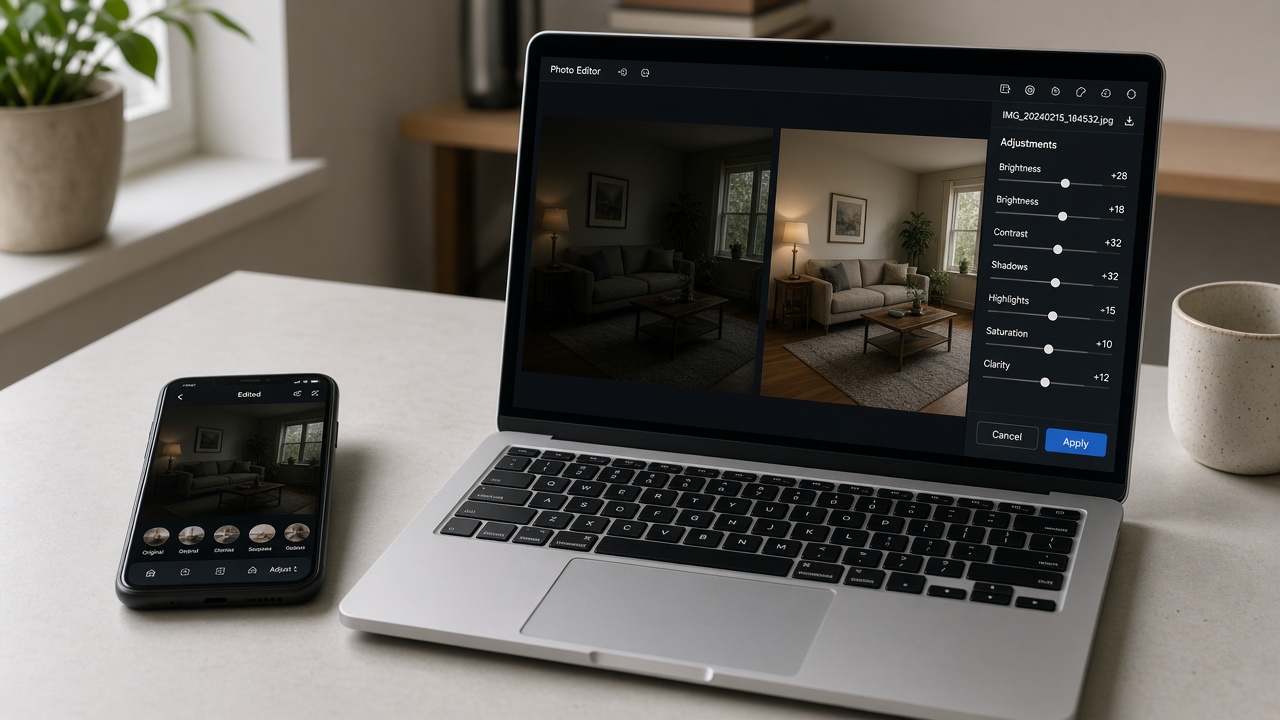
Understanding the Linguistic and Conceptual Side of These Three Controls
Yes, we’re going a little nerdy. Stay with me—it makes the sliders less mysterious.
Etymology in plain English: brightness grew from ideas of light and shine; in editors it means a luminance shift. Contrast comes from the idea of standing against; in photos it means tonal separation. Saturation traveled from chemistry and color science; it means how pure or gray a hue feels.
Polysemy—same word, different jobs: brightness can mean a phone screen setting, a mood, or a slider. Contrast can mean a rhetorical clash or an S-curve. Saturation can mean market demand or chroma. Here, we only mean image tone and color correction.
Hypernyms and hyponyms: broader buckets include photo editing, image processing, and color correction. Specific moves include lifting a dark JPEG, boosting contrast on a scan, or muting a loud product color. Holonyms—the wholes—include an image toolkit, a publishing workflow, an ecommerce prep pipeline. Meronyms—the parts—are the three sliders, the upload zone, live preview, Apply, and download.
Collocations people actually search: “adjust brightness,” “increase contrast,” “boost saturation,” “live preview,” “download edited image,” “free online tool.” Those phrases aren’t fluff. They’re how real users describe the job.
Connotations: high saturation often reads energetic or social-ready. Low saturation can feel calm or melancholy. High contrast feels bold. Low contrast feels soft. None of that is a rulebook. It’s viewer psychology you can use on purpose.
Attributes, Use Cases, and Misconceptions
Common attributes of a solid online adjuster: free access, live preview, simple sliders, everyday format support, quick download, no watermark, no account wall.
Rare attributes worth noticing: whether preview is instant while final export is applied cleanly; upload size limits; honesty about what the tool cannot recover.
Unique to ImageToolkit Adjust: it stays deliberately lightweight—brightness, contrast, saturation only—inside a broader free toolkit (compress, convert, resize, watermark, background remover). You’re not trapped in a mega-editor maze for a five-minute tone fix.
Practical use cases: blog hero polish, listing photos, soft outdoor snaps, quick social crops, and yes—dark phones and flat scans. For a deep dive on underexposed rescue specifically, read Brighten Dark Photo Online Free. Different search intent. Same toolkit.
Misconceptions I push back on:
- “Max saturation looks professional.” Usually it looks fake.
- “Brightness alone fixes flat photos.” Flat usually wants contrast.
- “If it’s still soft after tone fixes, keep cranking.” Soft focus needs a different tool—or a better source file.
- “Online tools can’t be ‘real’ editing.” For global tone, they’re often the smartest first pass.
I admit I’m not sure any single slider recipe fits every camera and every room light. Patterns help. Dogma doesn’t. Use your eyes.
Slider Patterns That Save Time (Without Becoming a Formula Cult)
These aren’t laws. They’re starting points I reuse:
- Slightly dark + flat: modest brightness lift, then contrast, then light saturation.
- Flat scan: calm brightness, stronger contrast, saturation near neutral.
- Washed / a bit hot: lower brightness slightly, raise contrast, keep saturation modest.
- Product needs pop: fix tone first, then a careful saturation nudge so brand color stays believable.
- Muted editorial: slight brightness, lower contrast a touch, lower saturation.
Editing a set? Write the winning triple down. Same settings across a batch keeps a product grid consistent. That’s half of ecommerce polish right there.
And if you’re bouncing between tools, finish tone here, then compress or convert as needed. Different jobs. Same pipeline.
Industry Notes: What Pros Quietly Do Before They “Get Fancy”
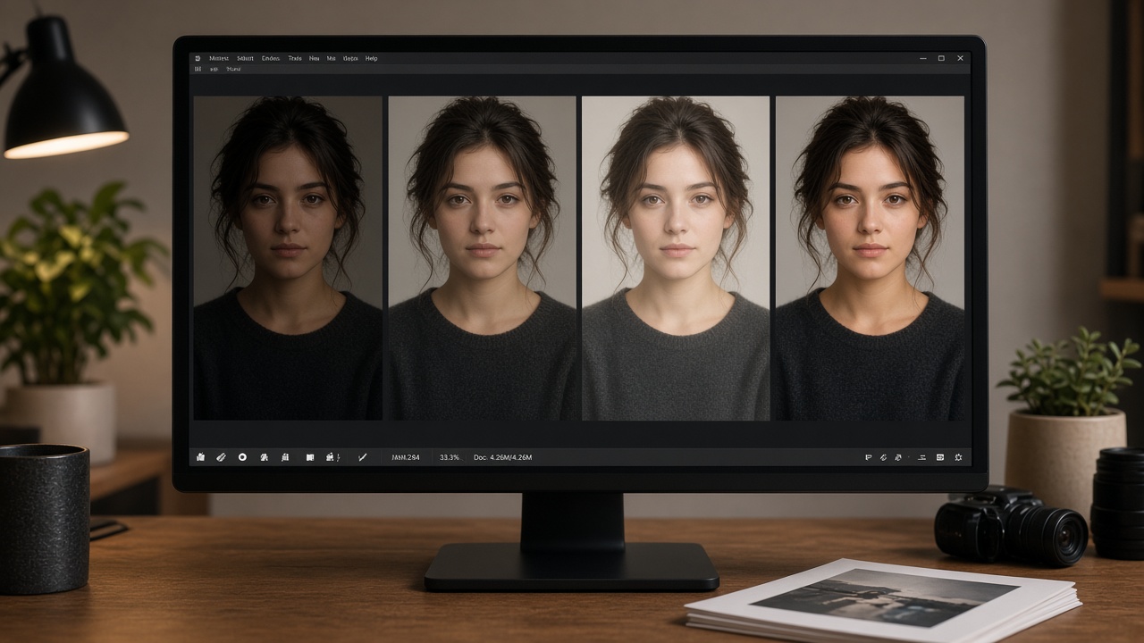
Talk to working shooters and sellers long enough and you’ll hear the same quiet habit: global tone first, local magic later. Brightness, contrast, saturation—or exposure and presence in Lightroom—come before healing brushes and composite tricks. Why? Because a clean base makes every later step easier.
I still remember a freelance week where I spent forty minutes masking a product reflection… then realized the file was simply too dark. One brightness pass would’ve saved half that time. Lesson learned the expensive way. Now I run a thirty-second tone check before I get clever. Every. Single. Time.
Online tools fit that “first pass” role perfectly. You’re not abandoning craft. You’re sequencing it. Fix the obvious. Then decide if the image deserves a deeper edit. Most social and listing photos never need the deeper edit. That’s not laziness. That’s triage.
Another insider tell: consistent batches beat heroic one-offs. If you sell ten candles, don’t invent ten different saturation moods. Pick a triple. Apply it with judgment. Your grid will look like a brand, not a garage sale.
Practical Applications Across Jobs (With Honest Limits)
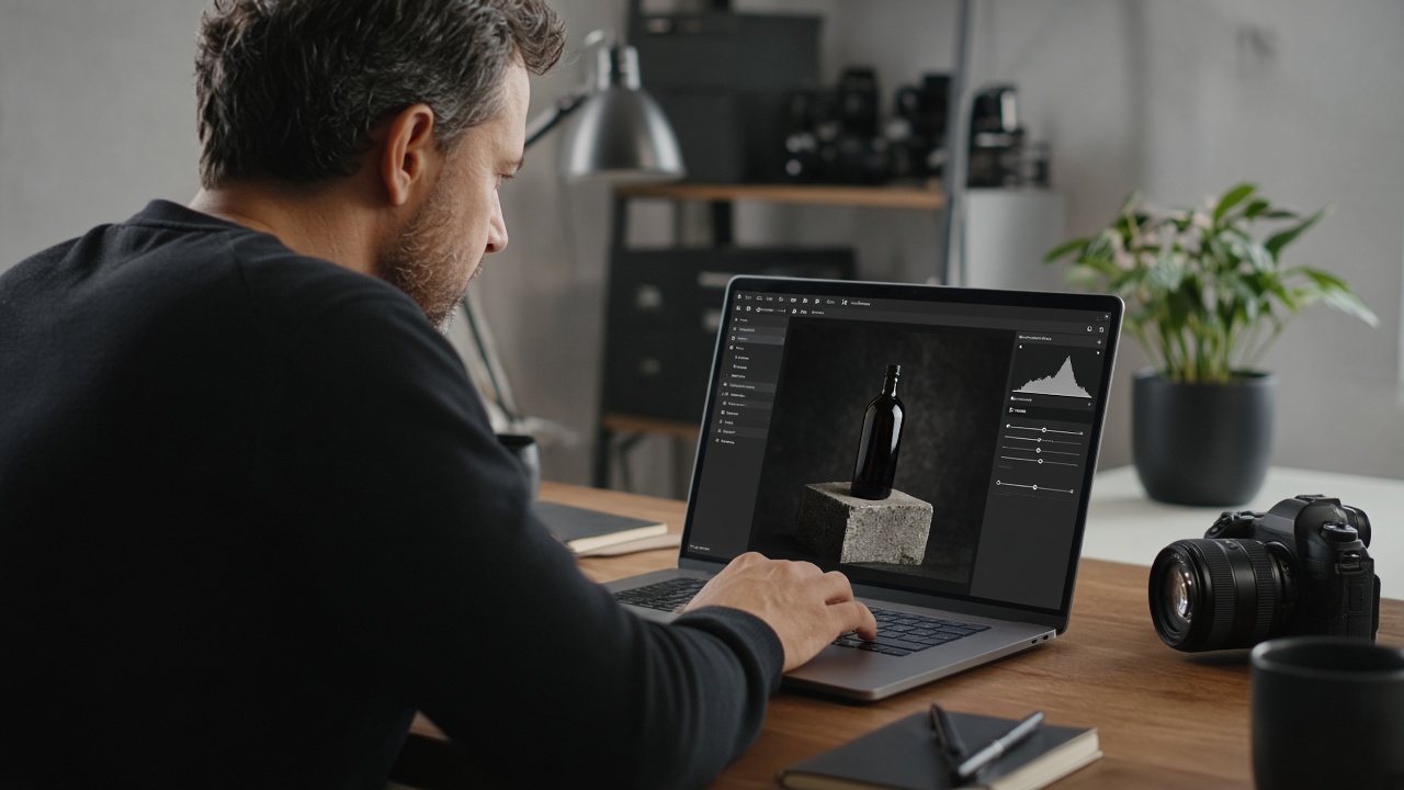
Bloggers and publishers: hero images and inline shots get a quick readability pass before publish. Dark screenshots of UI? Contrast often matters more than brightness.
Ecommerce sellers: white backgrounds that look dirty gray usually want brightness + contrast, then careful saturation so brand color stays true.
Students and office folks: flat scans of worksheets and receipts become readable with contrast-forward edits.
Social managers: phone dumps from events get a fast tone pass so the feed doesn’t look like it was shot in a basement… unless it was shot in a basement and that’s the joke.
Designers: sometimes you only need to test a direction—“what if this were punchier?”—before opening a heavier app. A browser adjuster is a sketchbook for tone.
Limits again, because trust matters: no local retouching, no object removal, no miracle detail rebuild. If you need those, graduate tools. Don’t force a screwdriver to act like a full workshop.
Future Trends Without the Hype Spiral
AI editors will keep promising one-click miracles. Some will help. Some will smear faces into plastic. Classic tone controls aren’t going away, though. They’re fast, predictable, and easy to explain to a client. “I lifted brightness and contrast” beats “the model did a thing.”
I expect free online adjusters to keep improving preview speed and export quality while heavier apps chase generative fill. Fine. Different lanes. For Google-facing content, clear how-tos on brightness, contrast, and saturation still match how people search—because that’s how people still talk about the problem.
So yes: learn the old dials. Use the new tools when they earn it. Don’t throw away a five-minute fix because a demo reel looked flashy.
A Short Field Checklist Before You Hit Apply
I keep this list in my head like a preflight check:
- Did I diagnose dark vs flat vs dull-color first?
- Did I move brightness before contrast before saturation?
- Did I stop before highlights clipped?
- Do faces and brand colors still look human?
- Did I check the result on a second screen?
If any answer is “uhh,” pause. The Apply button isn’t a finish line. It’s a commitment. Treat it that way and your hit rate climbs.
Also—and this is the unglamorous part—keep originals. Duplicate the file or rely on non-destructive preview until export. I’ve overwritten a “maybe” version and regretted it. Once. That was enough.
Want a metaphor? Tone editing is seasoning, not deep frying. A pinch wakes the dish up. A fistful ruins dinner. Your photo is dinner. Don’t fistful it.
Reader Objections I Hear (And How I’d Answer Them)
“Isn’t this too basic?” Basic is where most photos fail. Advanced tools don’t fix bad sequencing.
“Won’t Google favor longer AI mega-guides?” Clear answers and useful steps still win featured snippets. Fluff doesn’t.
“Can’t Auto Enhance do this?” Sometimes. When it guesses wrong, manual dials let you disagree. That control is the point.
“Why not just buy Lightroom?” Buy it if you live in catalogs and local edits. For a single dark-flat-dull JPEG before lunch? Browser wins.
I respect heavy software. I also respect time. Use both without tribal loyalty.
One last practical note before FAQs: if you’re optimizing this topic for search, keep your primary phrase natural—“adjust brightness contrast saturation online”—and support it with real collocations like “increase contrast,” “boost saturation,” and “live preview.” Don’t stamp the same exact phrase into every subheading. Readers notice. Algorithms notice thinner and thinner. Useful structure beats parrot repetition.
And if a reader arrives from a dark-photo query, send them to the companion post instead of stretching this article into two competing intents. Helpful internal links are ranking hygiene. Cannibalization is ranking self-harm.
Conclusion: Three Dials, Clear Intent, Better Photos
Brightness sets how light the frame feels. Contrast sets how punchy the tones feel. Saturation sets how bold the colors feel. Master that trio and you can rescue a shocking number of everyday images without opening a full editor.
In my experience, the winning habit is almost boring: upload, brightness, contrast, saturation, preview, apply, download. Same order. Small moves. Honest eyes. Tools like ImageToolkit Adjust exist so a five-minute tone correction doesn’t become a twenty-minute production.
If your next headache is a nearly black underexposed phone shot, jump to the focused companion post: how to brighten a dark photo online free. Different keyword. Different intent. No ranking clash—just a cleaner path for readers.
Now grab the photo that’s been annoying you. Make one careful pass. If it looks better, you’re done. If it looks worse, you learned which dial lied. Either way, you’re no longer stuck at “eh, good enough.”
Bookmark the tool. Reuse the order. Teach it to a teammate in two minutes. That’s the quiet power of brightness, contrast, and saturation: they’re learnable, repeatable, and good enough for most of the internet’s daily photo problems—without turning every edit into a weekend project. Start with one photo today. Momentum beats perfection. Tomorrow, do three. Soon the workflow feels automatic—and “too dark / too flat / too dull” stops being a blocker. That’s the whole game. Open Adjust on the next dull JPEG, run the three dials in order, and ship. Consistency beats occasional hero edits all year long.
Frequently Asked Questions About Adjusting Brightness, Contrast, and Saturation Online
People ask the same practical questions when they search this topic. Below are clear answers you can use right away—definitions, order of operations, tool limits, and when a desktop editor still wins.
What is the difference between brightness, contrast, and saturation?
Brightness changes overall lightness. Contrast changes how far dark and light tones sit apart. Saturation changes color intensity. Brightness fixes exposure feel. Contrast fixes flatness. Saturation fixes dull or overcooked color. Use them together, but start with brightness, then contrast, then saturation.
How do I adjust brightness contrast saturation online for free?
Open a free tool like ImageToolkit Adjust, upload your photo, move the three sliders while watching the live preview, apply, and download. No signup and no watermark. Keep changes small so the result still looks natural on phone and desktop.
Should I change saturation before contrast?
No—do contrast first. Contrast already shifts how vivid colors appear. Saturating early means you’ll likely re-tune later. Tone first. Color second. You’ll finish faster and with fewer “why does this look weird?” moments.
Can these sliders recover detail in blown highlights?
Usually not. If the original already clipped to pure white or pure black, that detail isn’t hiding—it’s gone. Tone tools redistribute what’s left. Protect remaining midtones and avoid making clipping worse. Better exposure next shoot still wins.
Do I need Photoshop to adjust brightness and contrast?
Not for quick global fixes. A browser adjuster is enough for most everyday JPEGs. Photoshop still wins for local edits, layers, and advanced color work. Pick the tool that matches the job, not the tool with the longest feature list.
Why do my edits look fake after I raise saturation?
You probably pushed too far, too fast—especially on skin, skies, or brand reds. Let contrast carry some of the “pop.” Take smaller saturation steps and judge on a second look. If it shouts, it usually isn’t done.